Common actions
Common actions are frequently used actions that appear multiple times across different components and workflows. For platform consistency, these actions should only be applied in the ways described below.
Regressive actions
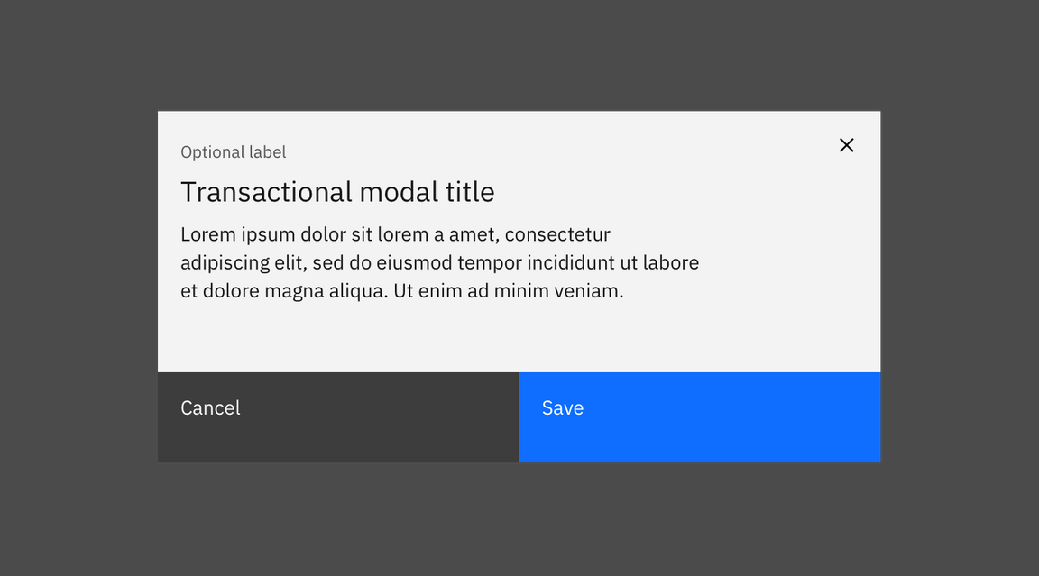
Cancel
Cancel stops the current action and closes the component or item. The user should be warned of any possible negative consequences of stopping an action from progressing, such as data corruption or data loss.
Usage: Use a secondary button or a link.
Clear
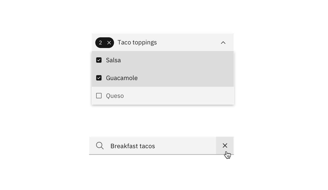
This action clears data from fields or removes selections. Clear can also delete the contents of a document, such as a log. Typically, the default selection or value is reset for controls that have a default selection or value, such as radio buttons.
Usage: Use the x icon on the right side of a field, item, or value.
Close
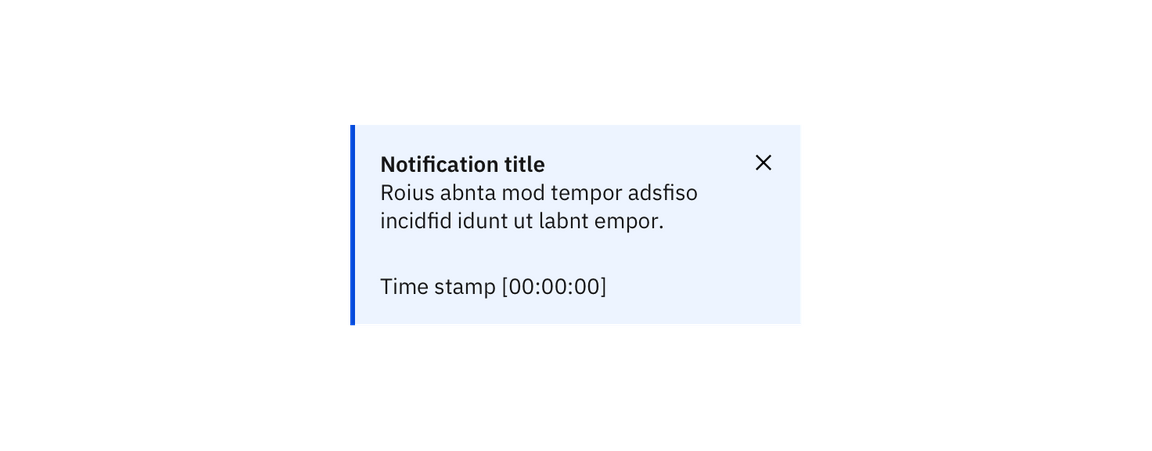
This action closes the current page, window, or menu. One example is closing a secondary window containing help. Close is also used to dismiss information, such as notifications.
Usage: Use the close icon, which is typically placed on the upper right side of the element. Do not use close in a button.
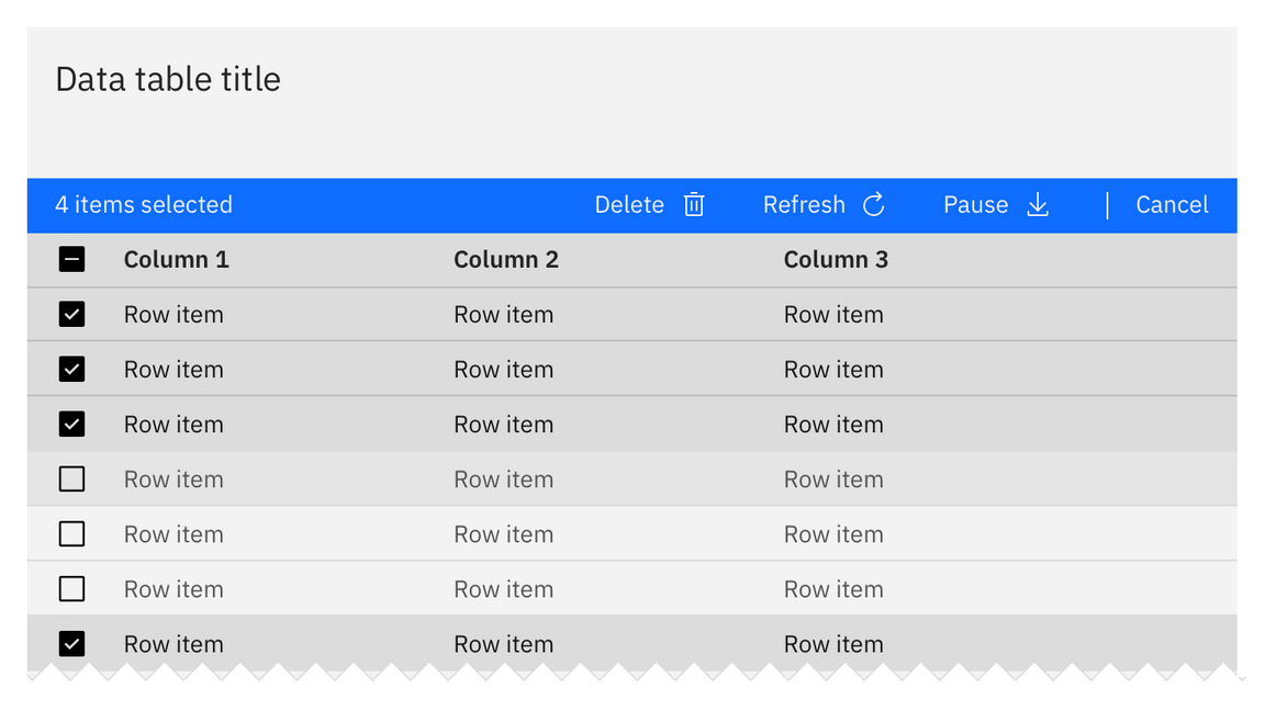
Delete
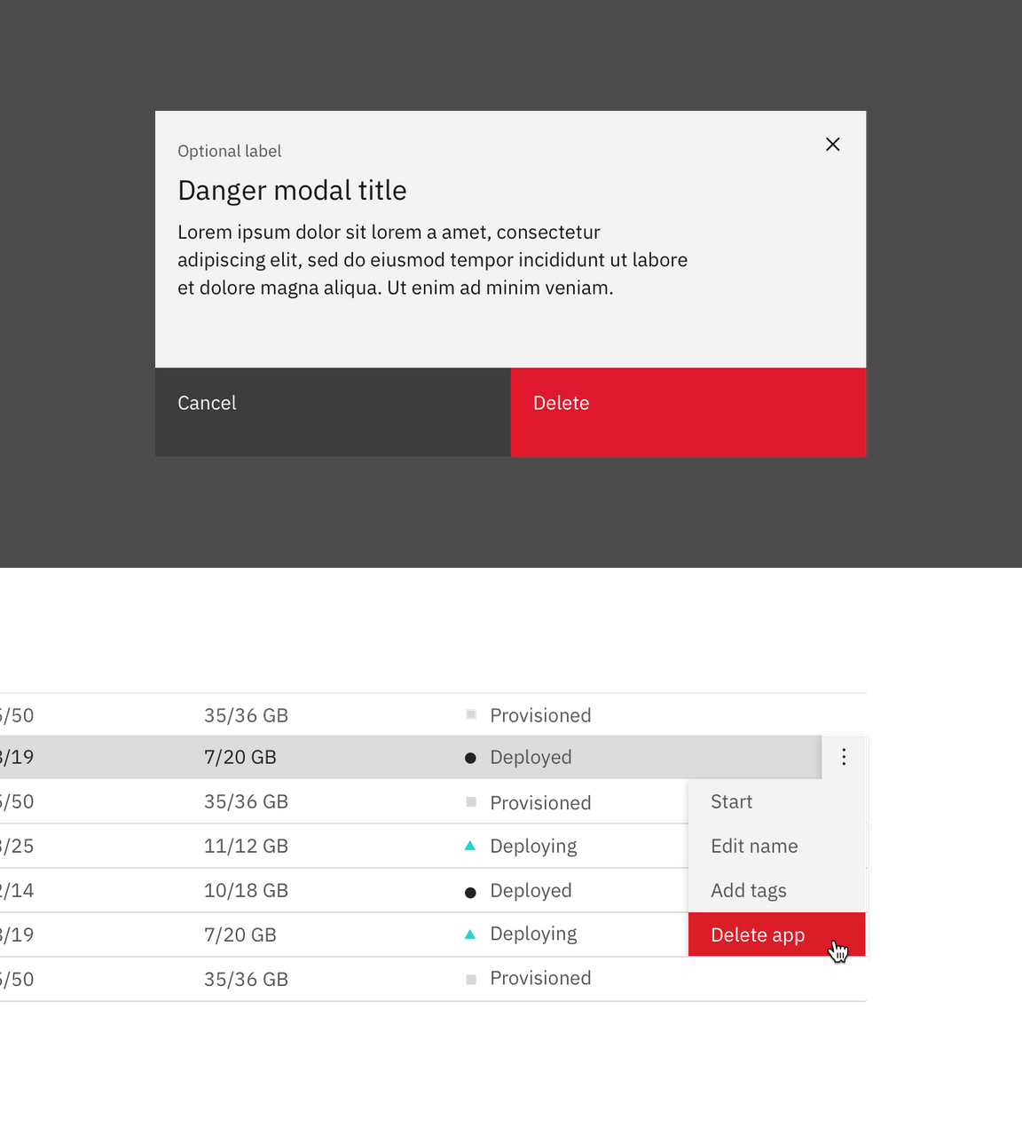
This action eradicates an existing object. Delete actions cannot be easily undone and are typically permanent. The user should be warned of the negative consequences of destroying an object, such as loss of data.
Usage: Use either the delete “trash can” icon, a danger button, or a danger option in a menu. A danger modal is used when a warning is needed to confirm an action.
Remove
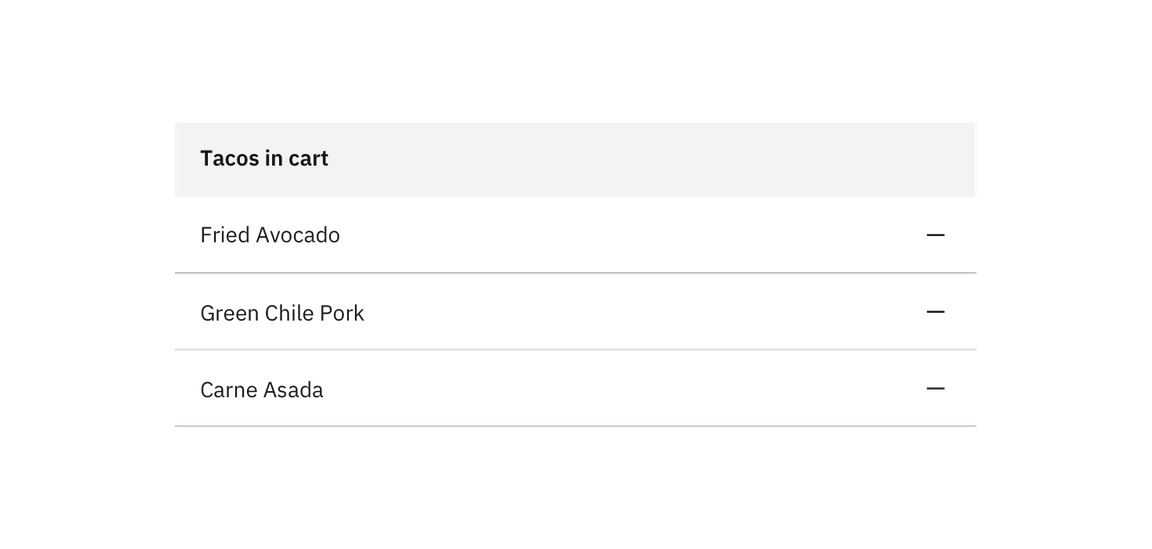
This action removes an object from a list or item; however, the object is not destroyed as a result of the action. Multiple objects can be removed at once.
Usage: Use as a button or subtract icon or glyph.
Reset
This action reverts values back to their last saved state. The last saved state includes the values stored the last time the user clicked or triggered “Apply.”
Usage: Typically applied as a link.

Progressive actions
Add
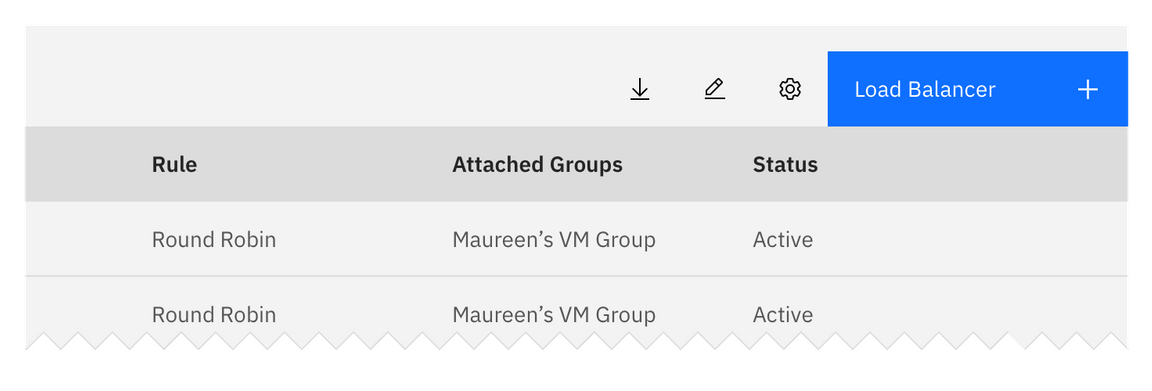
This action adds an existing object to a list, set, or system. For example, adding a document to a folder.
Usage: Use a primary button, button with icon, add--glyph or add--outline icon.
Copy
Creates a new identical instance of the selected object(s) in a specific destination.
Usage: Use the copy icon with the confirmation “copied” tooltip appearing post-click.

Edit
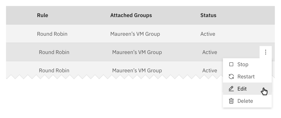
This action allows data or values to be changed. Edit commonly triggers a state change to the targeted object or input item.
Usage: Use as an option in a menu, or as a button or edit icon.

Next
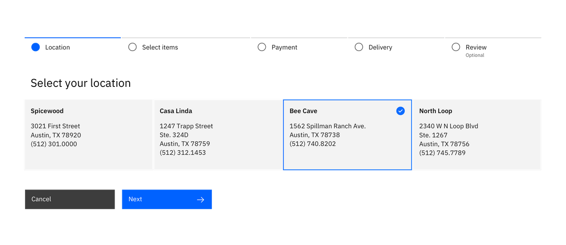
Advances the user to the next step in a sequence of steps, such as in a wizard.
Usage: Use a button with icon or a standalone forward icon.
Refresh
This action reloads the view of an object, list, or data set when the displayed view has become unsynchronized with the source.
Usage: Use the refresh icon or a button.
