Notification
General guidance
Notifications are messages that communicate information to the user.
Format
Title
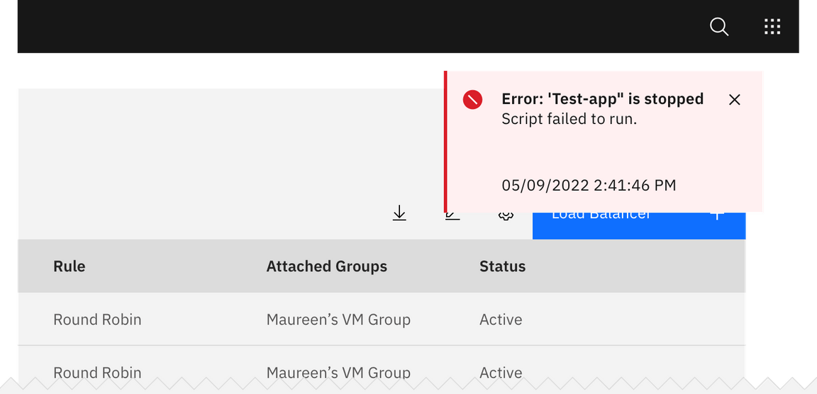
All notifications have subject titles, which should be short and descriptive. (Example: “Tester-app-02 has crashed.”)
Message
We recommend the body of the notification be contained within two lines. Be descriptive and include any troubleshooting actions or next steps. When possible, communicate the main message using just the title. You can include links within the notification body that redirect the user to next steps.
Dismissal
We recommend that toast notifications automatically disappear after five seconds. Inline notifications are persistent until the user dismisses them. All notifications have at least one method of dismissal (typically, it is a small “x” in the upper right hand corner).
Icons
Icons may provide additional clarity. Icons should be placed to the left of a title. These glyphs (16x16) can be found in the iconography library.

Variations
| Notification type | Purpose |
|---|---|
| Toast notification | Toasts are a non-modal, time-based window elements used to display short messages; they usually appear at the bottom of the screen and disappear after a few seconds. |
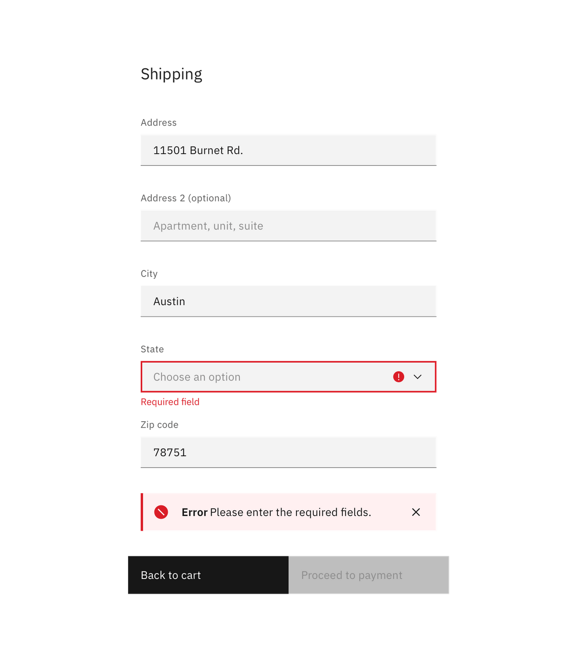
| Inline notification | Inline notifications show up in task flows, to notify users of the status of an action. They usually appear at the top of the primary content area. |
Placement
Toast notifications
Toast notifications slide in and out a page from the top-right corner. Actionable notifications do not appear on mobile screen widths.

Inline notifications
Inline notifications appear near its related item. In forms, we recommend placing the inline notification at the bottom of the form, right before the submission buttons. Depending on the context of the page, inline notifications can appear above the content as well.
